
Fortebank Mobile Banking Application
Defining the UX
I was aware that the our target user was less than tech friendly, unfamiliar with banking practices online and depending on age usually spoke a different language to the rest of their family; with older generations using computing services in Russian and the younger generation using Kazakh or English. Despite these limitations I tried to view them as an opportunity. Many of our target demographic only had experience of regular internet access on a mobile device. The drive forward in tech literacy had been driven by smartphones and the relatively new banking industry meant there was little regulation around how financial services could be built so I decided we should take a ‘Mobile First’ approach and try to do something new that would delight users. It was with this in mind that I felt we had to invent a comprehensive design language and one that we could stitch into the very fabric of the application’s architecture.
ForteBank are a bank based in Almaty, Kazakhstan. Kazakhstan as a region has a relatively young banking industry and for this reason many new banks and financial institutions have sprung up. ForteBank had aspirations of becoming the digital leader in this new emerging space but in a country with poor technical literacy and little trust for banking, this was ambitious. Therefore they turned to Monitise Create, a trusted name in financial application development. For the project Monitise Create hired me as the lead visual designer. The bank required an iOS application, an Android application and a responsive website to cater for the three spoken languages; Russian, Kazakh and English.

In approaching the UX for the application we tried to build something that would be immediately familiar and intuitive. We wanted to have a solid theory and backbone behind the decisions we made that would not only help a user navigate confidently but also help us make decisions about where best to place things in the future. In studying the proposed features for the applications, and during some early user testing, we noticed that there seemed to be two types of user states while using the app; review or action. Essentially, either a user was currently reviewing previous transactions and details or actioning a process such as sending money or paying a bill. Armed with this knowledge we created a navigation policy that vertical movements through the app would represent time; moving downwards would move you back through your transactional history and moving from left to right would represent your progress through an ‘action’, for example, sending money to a friend. This worked for us because it allowed us to ensure the application architecture never went too ‘deep’ and helped keep it familiar to earlier applications we knew users would have experience with, such as email clients and Facebook.
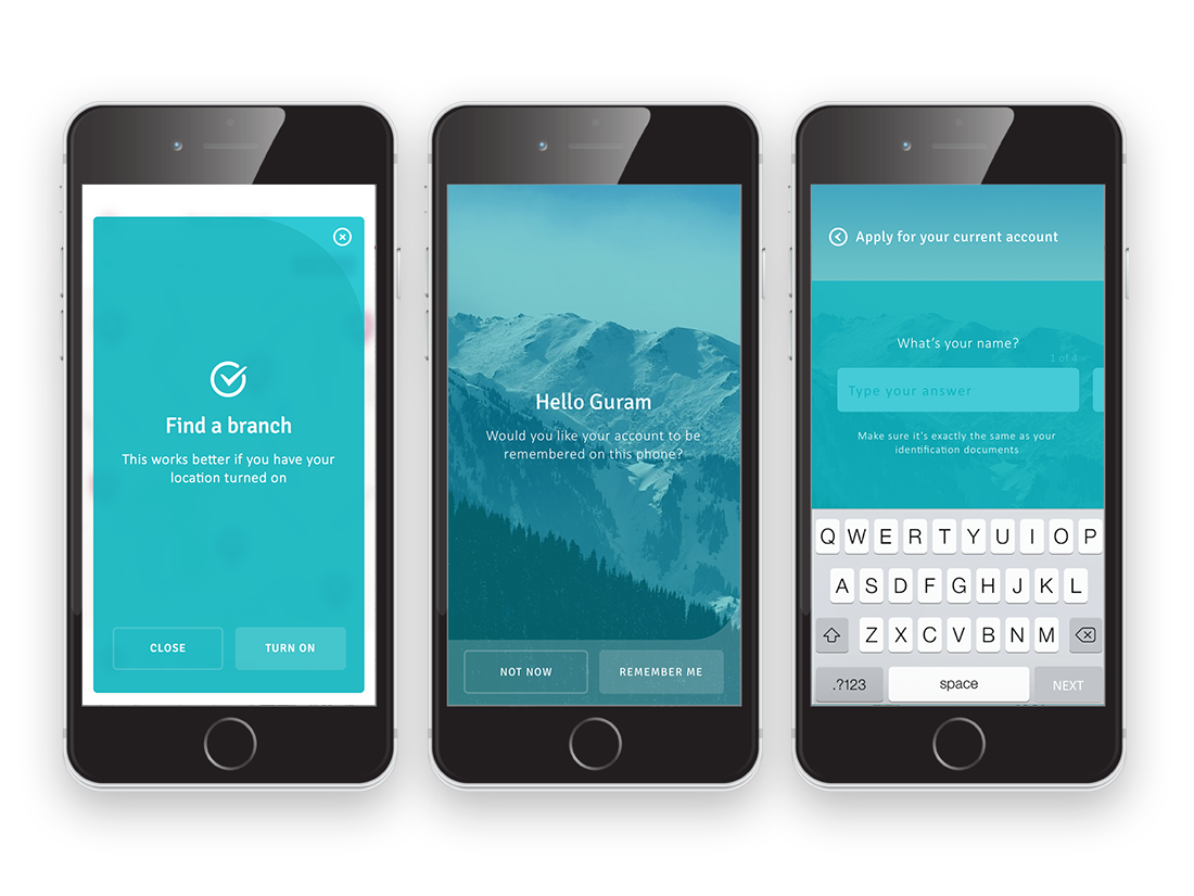
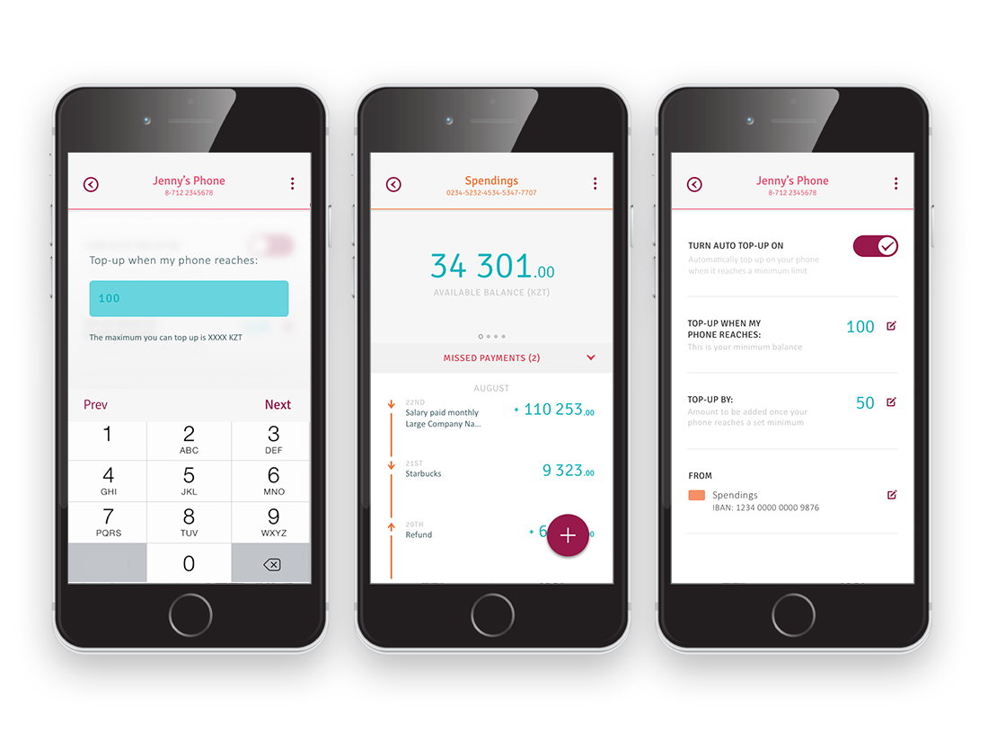
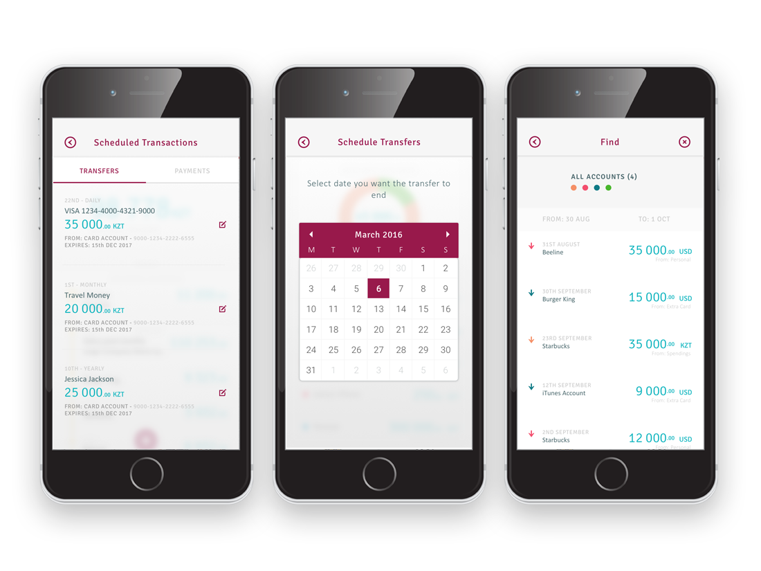
A large part of our task was to seek and solve business opportunities for the business. We aimed to drive user behaviour towards executing simple online tasks that previously could only be done in-branch. The two primary actions were sending money and paying bills. We developed a study group and tested various forms of delivery and found that a FAB button was the most popular solution by a long shot. We implemented the FAB button to contain these two primary actions with the logic that they would always be contextual, ie: tapping ‘Send Money’ while in an account would designate that account as the ‘From’ account.

Designing a visual language
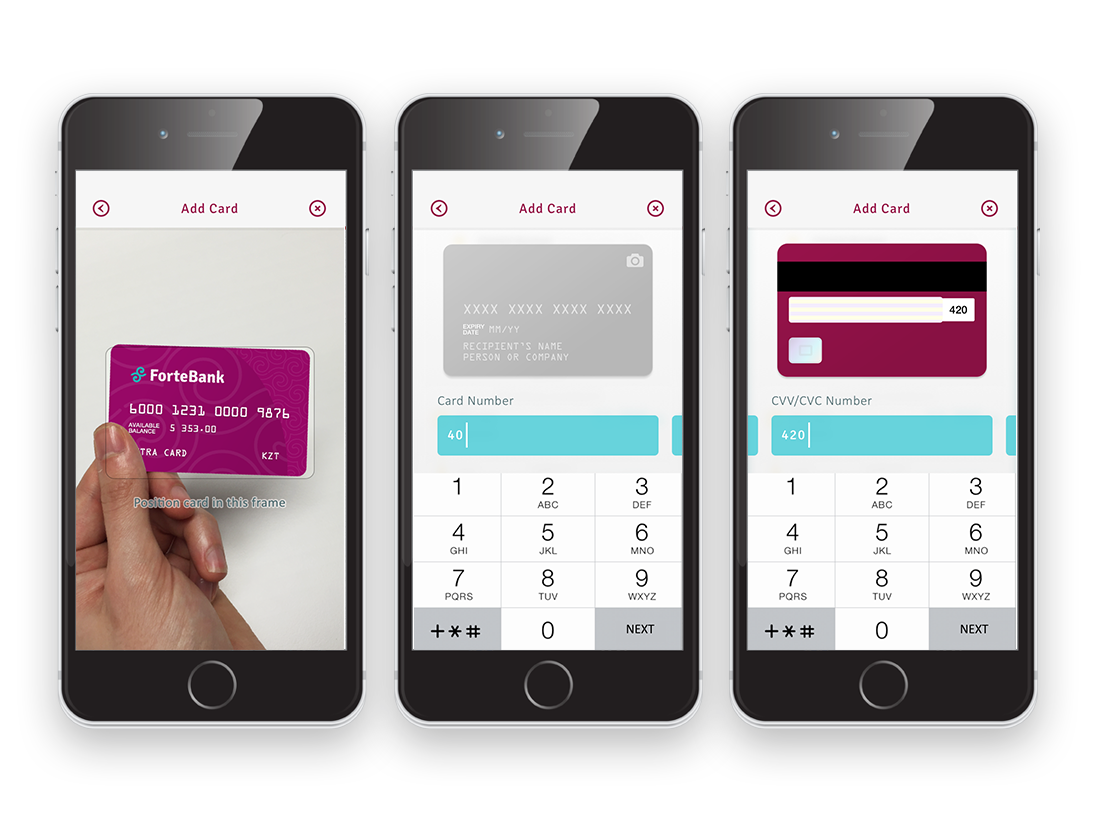
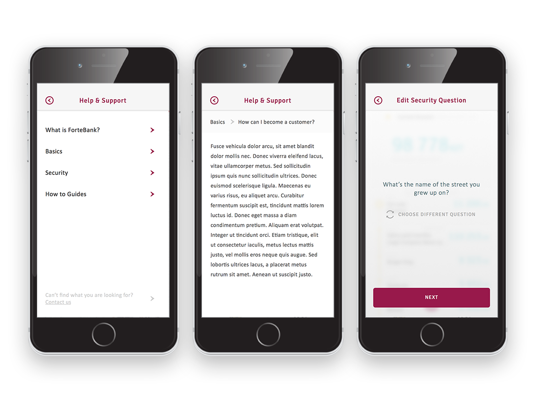
Once we had created the lexicon for the application’s UX we moved on to the visual design language. I knew that because we were dealing with multiple languages I wanted to lean heavily on iconography and colour. In earlier investigation I had discovered that the Russian and Kazakh alphabet would extend the copy to around 32% longer and this seemed to confirm those suspicions. In terms of existing digital assets from ForteBank we had two brand colours and their brand principles which were Simplicity, Trust, Transparency and ‘Kazakh touch’. We utilised the two brand colours we had, burgundy and cyan, to assume the app's two core characteristics. Burgundy would become an actionable (CTA) colour and the cyan would represent any monetary or transactional values. I felt the strong burgundy colour would work well as the interactive element as it reinforced the brand image of confidence and strength and the cyan would reflect calming, tranquil colour while reviewing finances (the bank were worried about potentially intimidating users). I also began to develop a custom icon set that we could use across all the applications, I wanted this to represent the ForteBank principles in that they were simple and intuitive but also to emphasis the ‘Kazakh’ end of the bank’s brand principles and thus enhance user trust.
Due to vast cultural differences we also had to test and learn quickly with our design and colour language. One problem we encountered was that the traditional model of green and red representing positive and negative was commonly misunderstood in the region. Either it was a new model for the users or the red was interpreted as a lucky or positive colour, similar to the asian model. Additionally, users in the region had the opposite perception of arrows representing the movement of money. In UK based tests we had noticed users felt that an arrow pointing up represented money that had entered their account and increased their balance and vice versa. In Kazakh tests we found their users felt that an arrow pointing up represented money moving out or away from their accounts with the opposite representing money ‘coming to me’. This I had to concede was a more common sense understanding but none the less left me feeling glad that we had tested our design language as thoroughly as our architecture.
Personalisation
In addition to the UX and UI embodying the bank’s brand ambitions, I felt we needed to inject these principles into the applications offering. After speaking with the bank we decided to allow users the ability to ‘personalise’ their banking application. I developed an additional colour palette for the customers to use within the app, allowing them to colour and rename their accounts and cards. They could reorder the position of each account, add their mobile phone and pensions accounts for review and even enable the viewing of their balance from their smartphone lock screen. In doing this I felt we could help a user truly take control of their financial information and digest it quicker and easier. Allowing the user to navigate to the data they wanted quicker also lightened the load on the banks servers, helped build a trusting user base and emphasised the transparent image ForteBank hoped to achieve. We also began to develop simple graphs to allow the user to understand the status of their accounts at a glance. They could see if they were overdrawn, how much money they had left, whether they had been paid or not and how much money they had earned from cashback accounts.


