
Hargreaves Landsdown Trading & Investment App
Hargreaves Landsdown are a financial and investment institution based in London, UK. They wanted to redesign their mobile offering, both for their current clients and to attract new users. Despite being digital leaders early on, the advent of newer mobile solutions such as Robin Hood and Plus 500 had left their application feeling bloated and painful to use. This they believed was costing them new users and therefore they wanted to redesign and redevelop a newer and simpler approach.

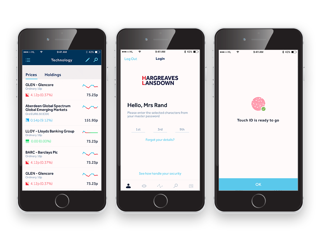
My task was to redesign the UX for the trading and login end of the application, the two largest pain points that currently existed for users. The login architecture was a relatively simple process, the current application had asked for multiple characters from a ‘Master password’ which had to be selected using a dropdown menu. Simply removing this and replacing it with an input field was the first major improvement in this process. I then proceeded to give a fresher more obvious hierarchy to the initial screens. We added a ‘Forgot password’ area and the ability to use Touch ID. In the end we had a simple flow that tested really well with users and was void of cul-de-sacs.
Redefining the Trading process
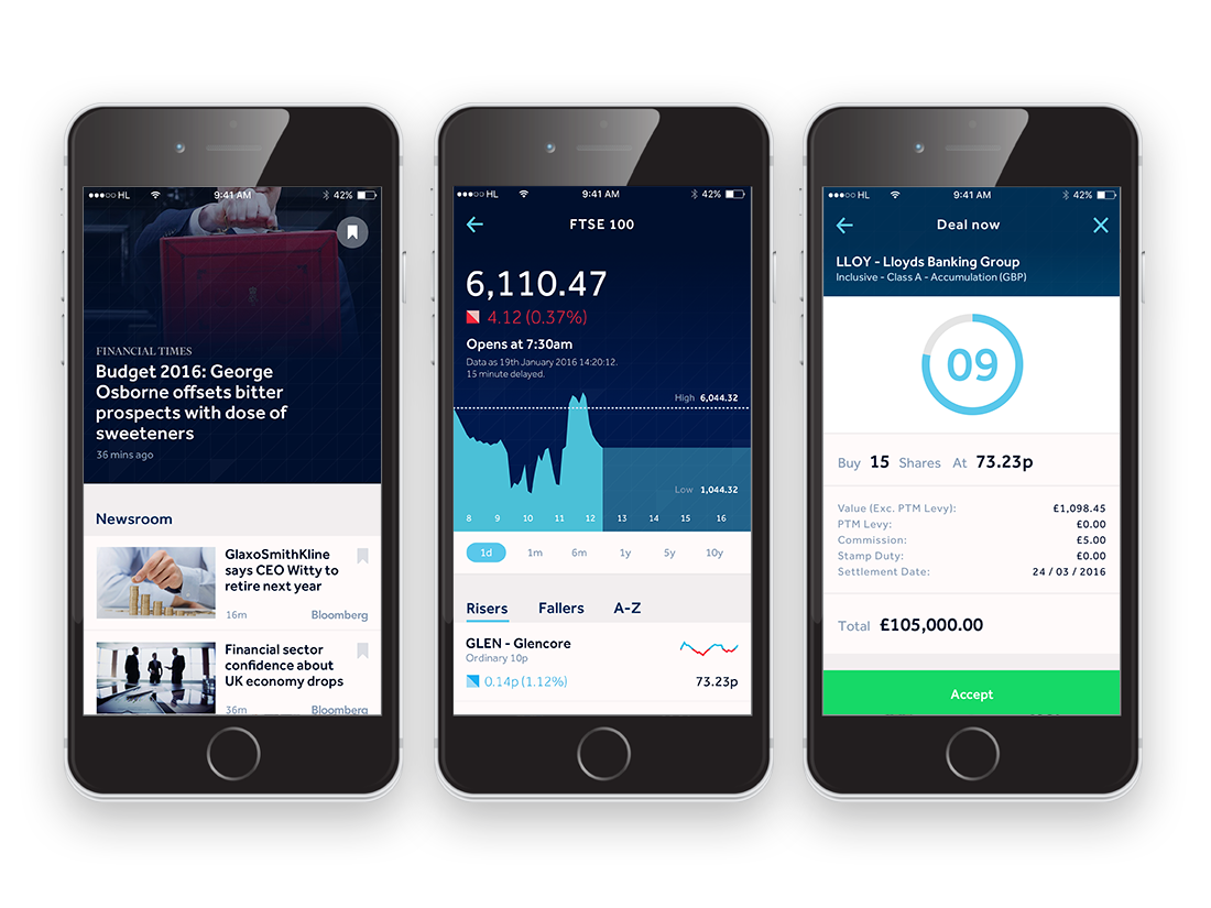
The second and much more substantial task was that of redefining the UX for trading, or put simply, buying and selling stock market options. This was a notoriously difficult and exhaustive subject matter that required extensive research and knowledge-gathering before I could even begin to simplify and rejuvenate the process. I was keenly aware that any slight oversight could mean a lot more than frustrated a user base. Many users utilised the application to invest their life savings and pensions. I began by mapping out the current application’s architecture and then defining the ‘red routes’ or the paths most commonly taken by users. Once I had defined the red routes I began to look for similarities amongst them and areas where I could improve their experience.
I discovered that the overall trading flow had five key sections; buying a stock, selling a stock, setting a stop loss, setting a buy limit and adding a stock to a watch list. This was traditionally how it was across all of Hargreaves applications and indeed across all trading platforms that I investigated. When I enquired why these five processes were placed together I was told that it was the ‘industry standard’. In other words, it had always been done that way. I had a hunch that a user would have fundamentally different mindsets when entering particular elements of this process and began testing different ways to approach this.

My fundamental belief was that a user approaching the ’trading’ section would be in one of two mindsets. Either they would be in an action mode, meaning they wanted to trade or a protection mode, meaning they wanted to place a stop loss or buy limit to protect what they owned. I then user tested some basic routes using the two new entry points for users and found that what I suspected was true. Once both routes were divided we discovered that users would only use one exclusively, reinforcing the idea that they would enter the app in one of two mindsets.
With our new foundation in place I was able to move forward streamlining the process for buying or selling a stock. I was able to reduce this from a huge number of screens to just four simple steps. I also developed some satisfying logic for when the market was closed, moving a user to set a buy limit or price alert and a stop loss when the user already owned the stock. This was something that we noticed was a common pattern in user behaviour beforehand and found it delighted customers in early user testing.
