*If video is blurry click on the settings cog and select 720p
Pollpass
For two years I was employed as the Head of Design and Growth at an AI powered Market Research company called Pollpass. It was a smaller team set within the larger organisation of GlobalWebIndex. Our goal was to build products that would solve business problems and open up new revenue opportunities for the organisation as a whole.
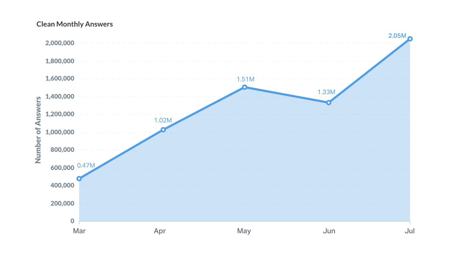
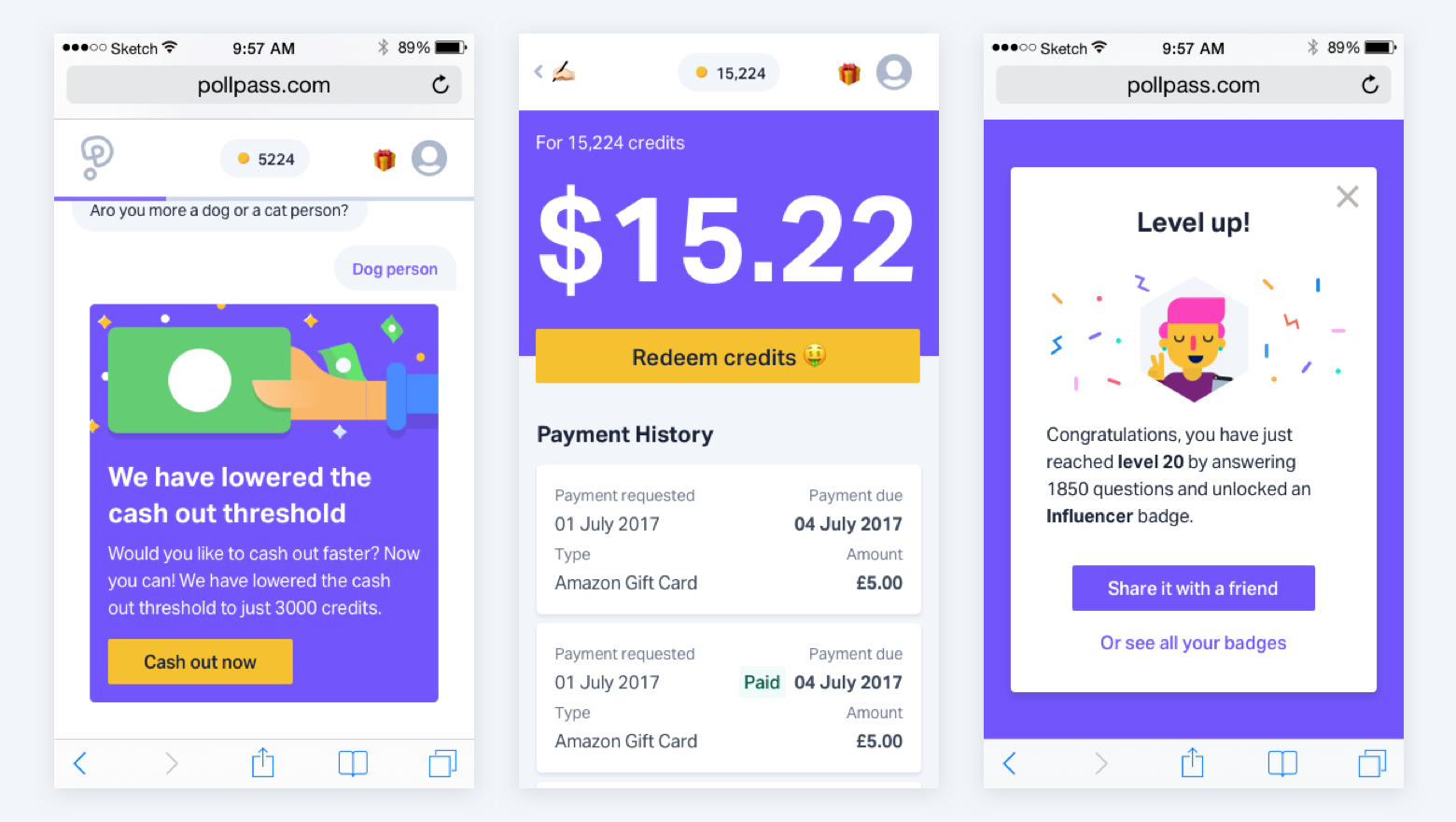
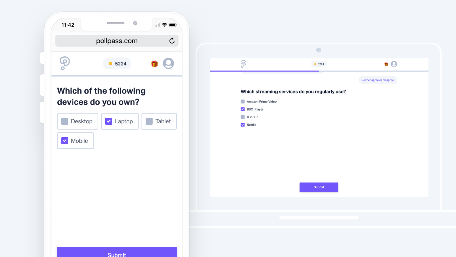
I joined this role when it was just a powerpoint deck and I fell in love with the product. Just before my departure, we had over 250k users and had just broke 65M answers collected for our clients. I oversaw a team of 12 and I'm responsible for all UX, UI, brand collateral and Growth (eg: User acquisition and retention).
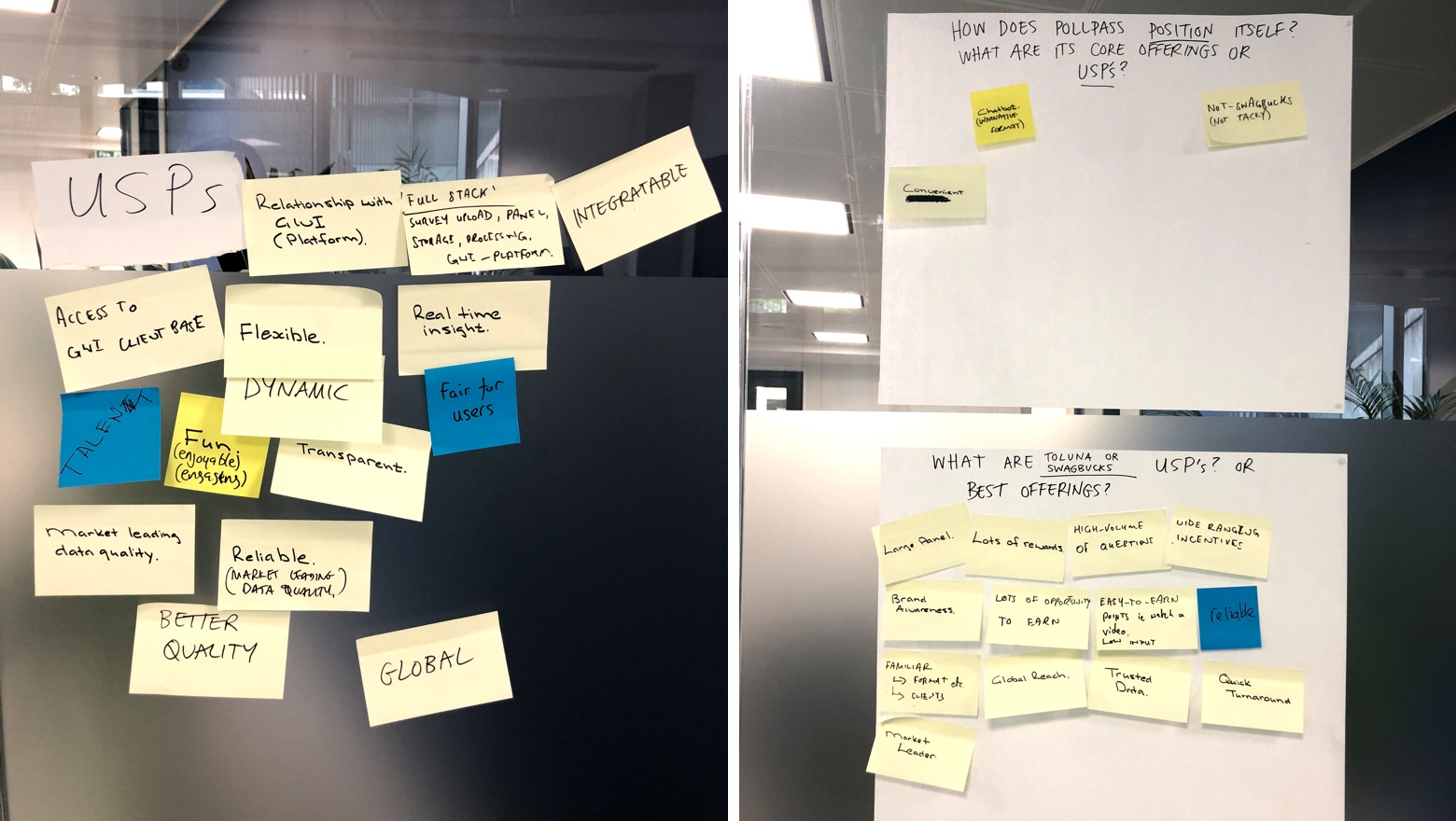
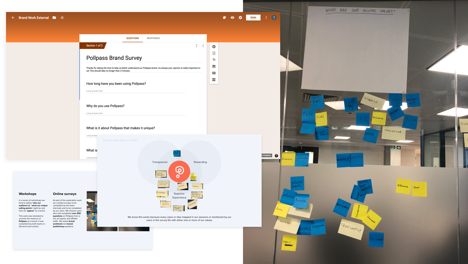
Armed with our market research and the findings from some early prototypes we planned a series of workshops to define our values. We knew we wanted our values to be north stars that we could reference when making tough product decisions. I had worked at many companies in the past with ambitious brand values which is admirable but they were usually abstract enough to mean very little to the individual and their work or they were disconnected from the reality of the company. I wanted us as a team to prescribe to values that we could use, that were functional.

We decided on three values, Transparent, Rewarding & Superior Experience. We ensured every member of our team was clear on their meaning and how their work could be 'Transparent', 'Rewarding' or provide a 'Superior Experience'. Whether you were a designer designing an input field or a customer support rep answering user emails. These values also mapped clearly to our USPs as a product which helped massively in our messaging. In fact, our 'Transparent' value was one of the reasons we had little work to do by the time GDPR took hold. Most of our competitors were in a panic about trying to conform to the new rules but our efforts to be 'Transparent' meant we already provided a lot of the best practises around privacy and user permissions already.
In designing our product we used a balance of User-Centred Design and Atomic Design. User-Centred Design (UCD) was used to help define 'what' the product should do. The idea of User-Centred Design is to involve Users throughout the design and development process. The team should include multidisciplinary skills and perspectives. You should aim to:
Specify the context of use: Identify the people who will use the product, what they will use it for, and under what conditions they will use it.
Specify requirements: Identify any business requirements or user goals that must be met for the product to be successful.
Create design solutions: Using Atomic Design
Evaluate designs: Evaluation - through usability testing with actual users - is as integral as quality testing is to good software development.
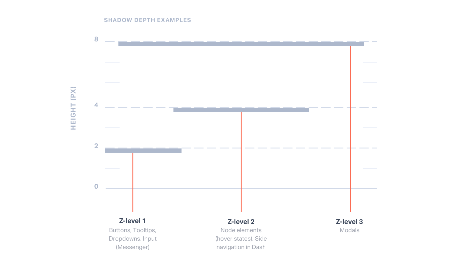
Pairing this approach with Atomic Design is incredibly powerful. Atomic Design is a methodology for creating Design Systems. This is the idea of breaking down components into basic atoms. It's easy to see what parts of the product can be reused, and how they can be mixed and matched to form other molecules and even organisms.
This approach allowed us to iterate and build flows quickly. In delivering a comprehensive Design System we were able to make code more consistent and to allow the developers to create styles and components quickly.
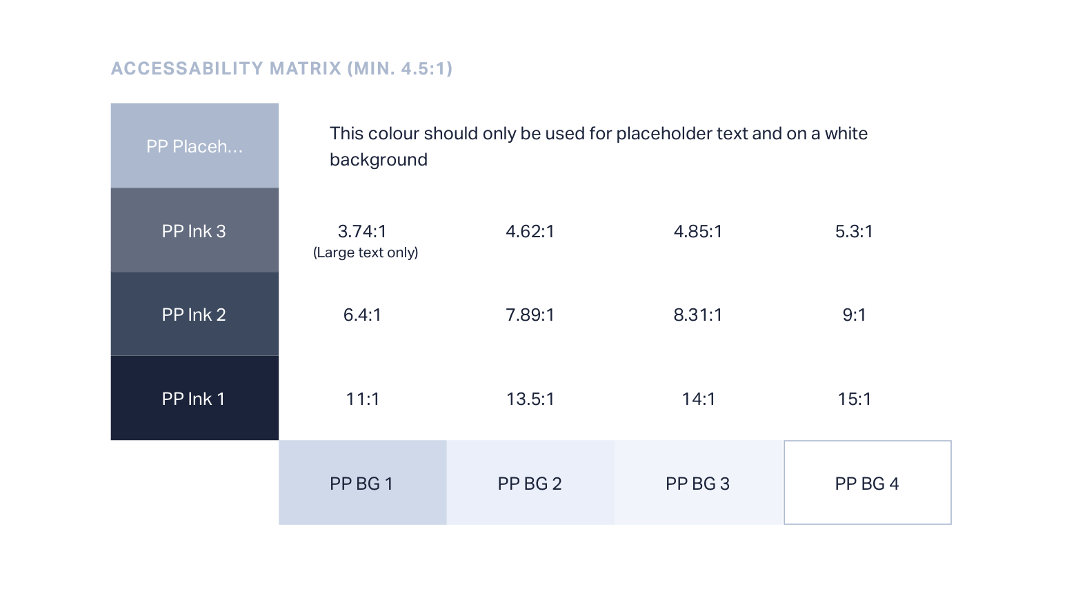
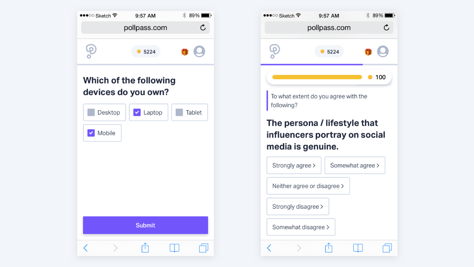
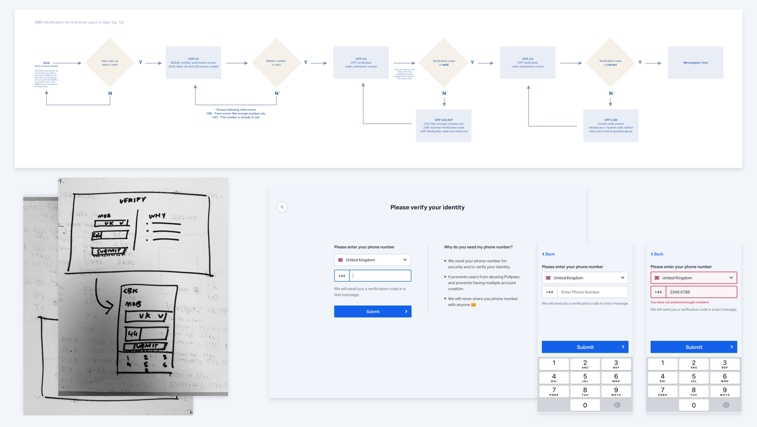
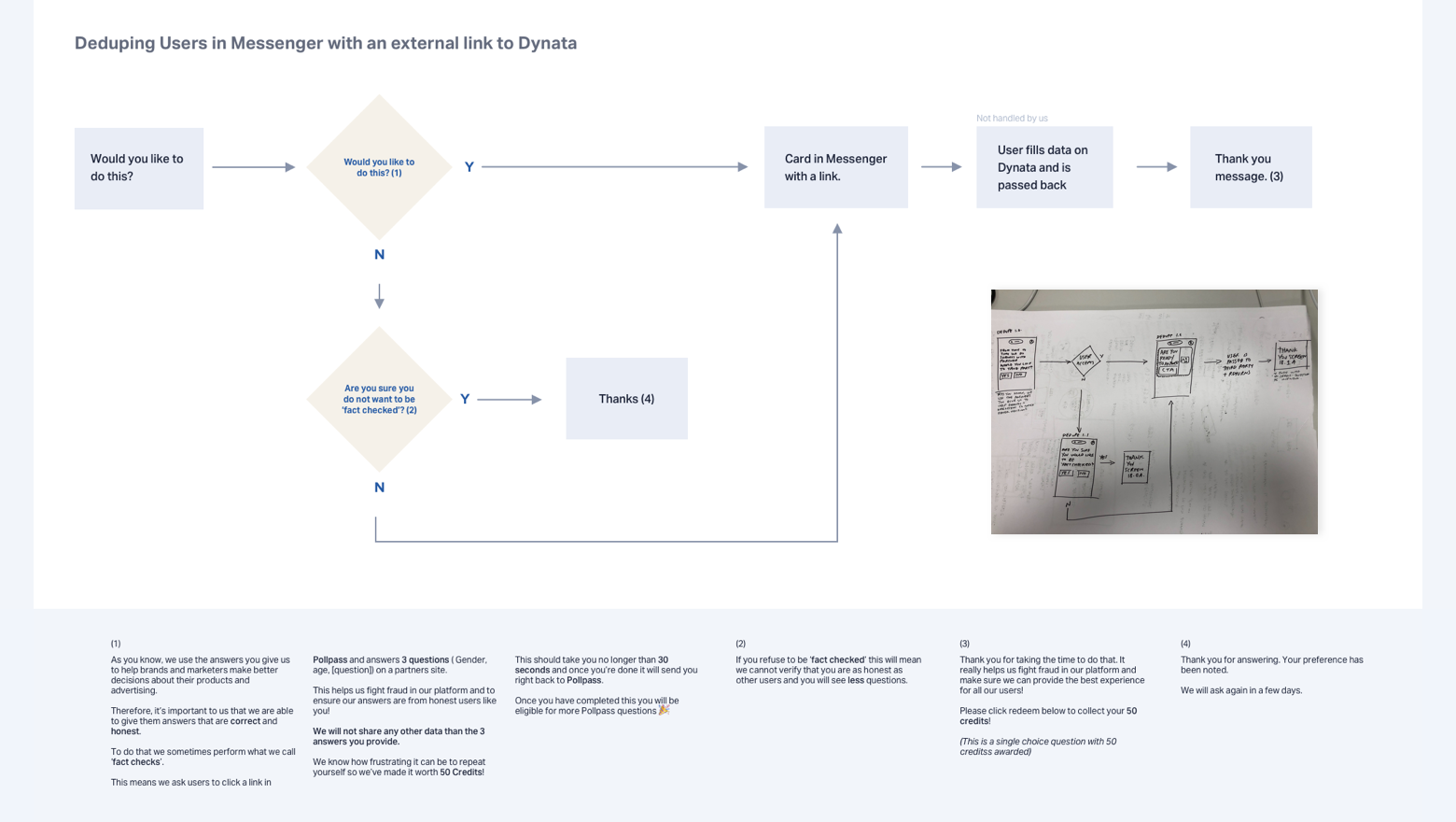
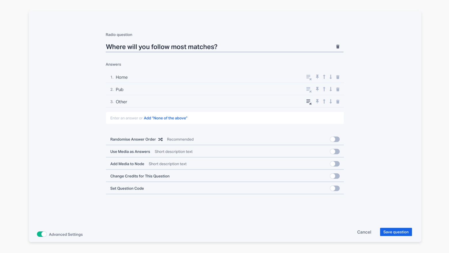
One of our decisions displays how we used our values and these ways of working concisely. We made the UX decision to not use semi-transparency in our style guide. Semi-transparency is commonly used to show that the user has not yet completed a task. They tend to be poor from a UX point of view as the text is usually unreadable and they offer no chance to educate the user. In their place we decided to use regular styles but with correctly labeled error fields or a warning educating the user about why their request could not be fulfilled.
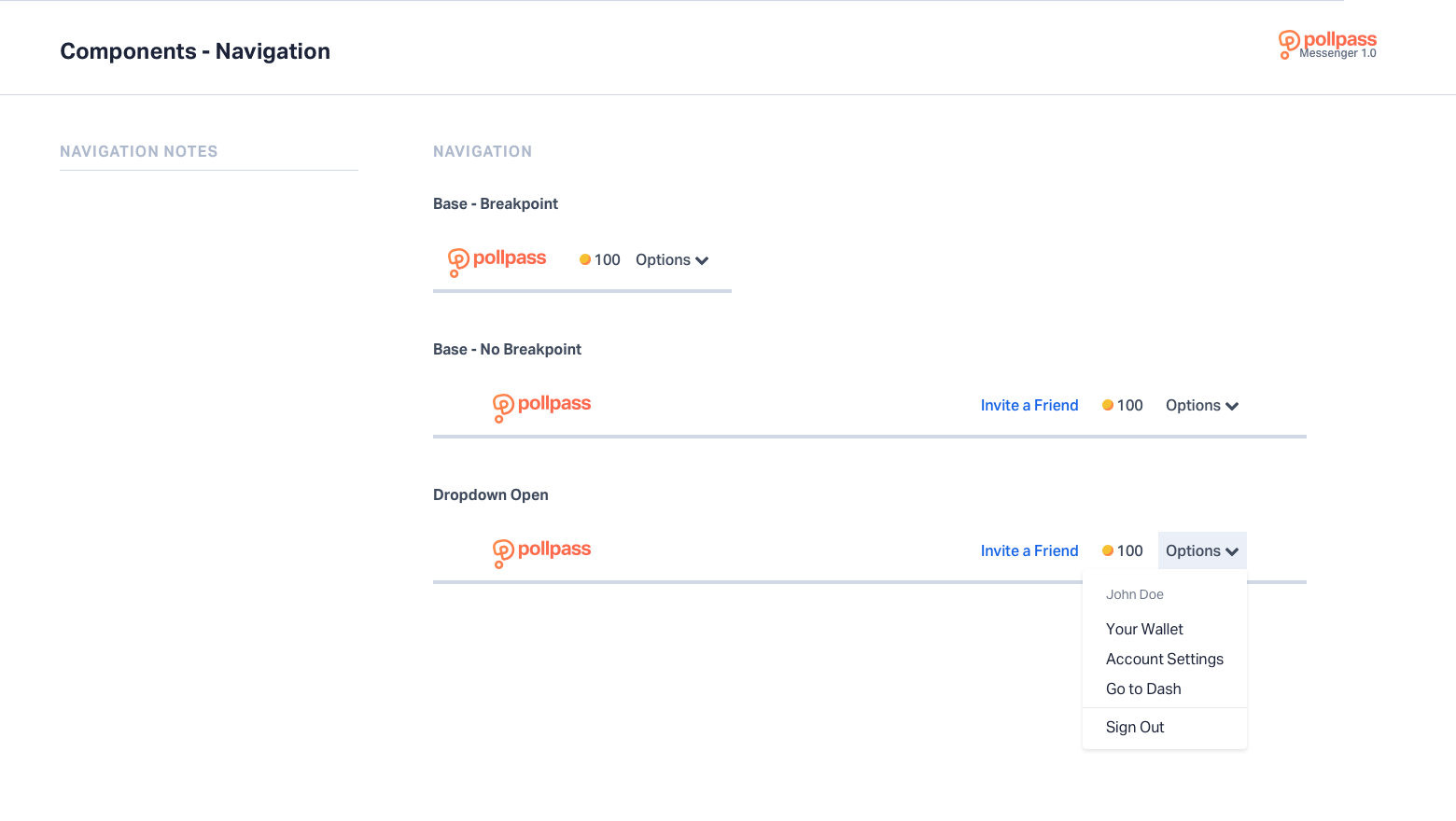
In addition to this we created a pattern we called 'progressive warnings'. This was a fun idea that caused our messaging or 'Warnings' to become more terse and visually obvious with each invalid request the user made. See below for example.
*If video is blurry click on the settings cog and select 720p
Refusing to use semi-transparency was in keeping with our value to be 'Transparent' and honest with the user. The 'Progressive Warnings' were more 'Rewarding' and certainly a 'Superior Experience'. Through UCD and our use of Atomic Designs we were able to use our brand values to delight the user and create a compelling product.
*An Illustration library we built to allow us to iterate and build complex illustrations quickly
A large reason a lot of competitor products were using legacy tech was that with Market Research you cannot simply change the interface without rigorously testing the impact of your UI or UX changes. Minor tweaks can have impacts on how a user decides to answer a question and the onus is on you to prove those changes are providing similar or better quality answers. From this point of view UX testing is very different when dealing with this type of product. Not only did we have to test the User Flows and prototypes but we also had to analyse the answers the users gave to ensure they were statistically correct.
Once we had launched our product we were overwhelmed with the feedback and demand. Our early research and testing had paid off, we had created a product that users loved. They loved it so much in fact that we couldn't keep up with demand and we had to turn off registrations while we retooled our infrastructure. (You can read my attempt at an apology to users here.) With this demand came a lot of clients. This was excellent but these clients had increasingly complex feature requests and it was soon apparent that our current solution for uploading surveys to our chatbot was inadequate. We explored other options like integrating with the industry standard tool, Qualtrics, but ultimately decided that building our own scripting tool would give us the most control. We started to build Dash.
Dash Demo Video:
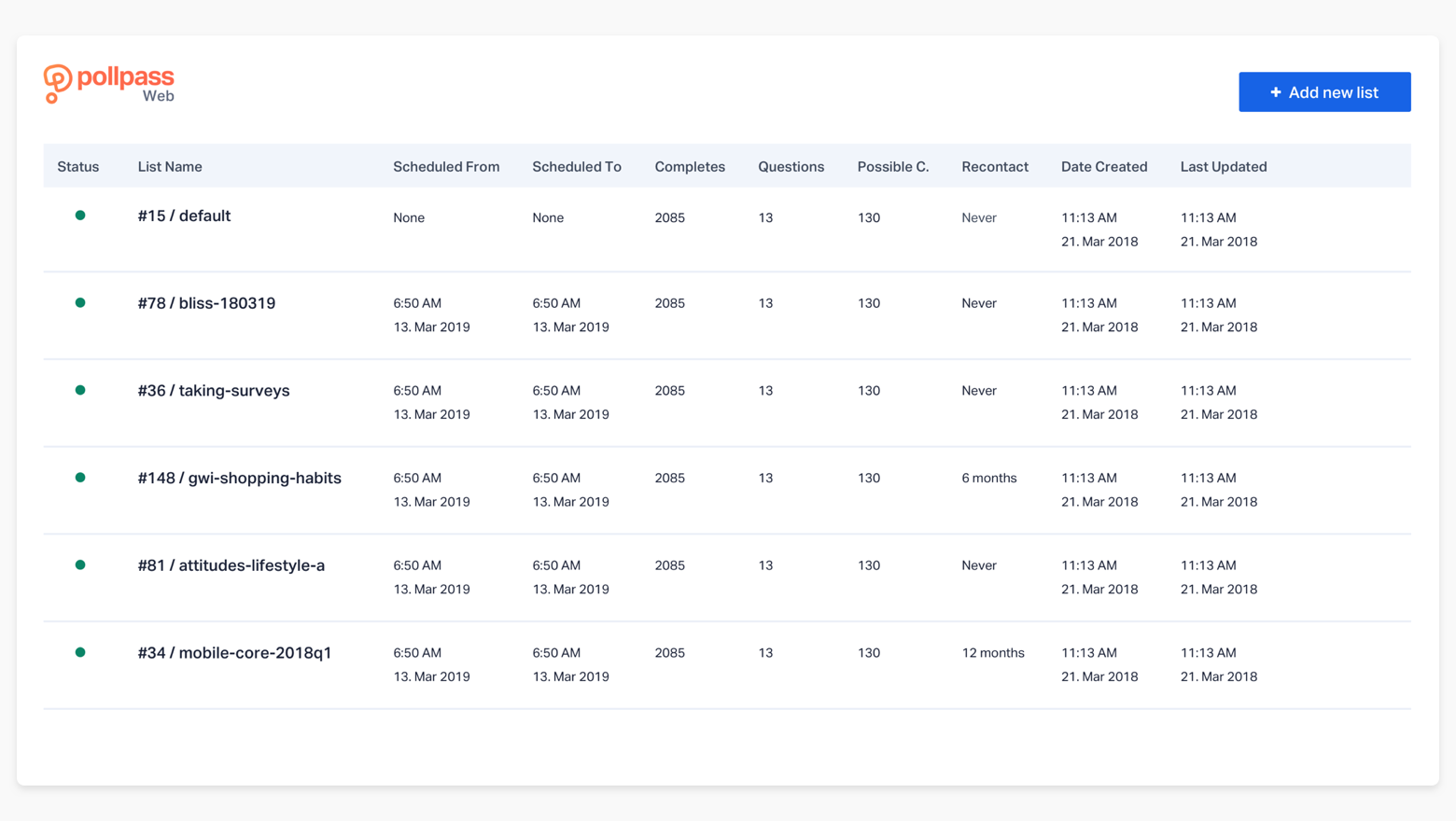
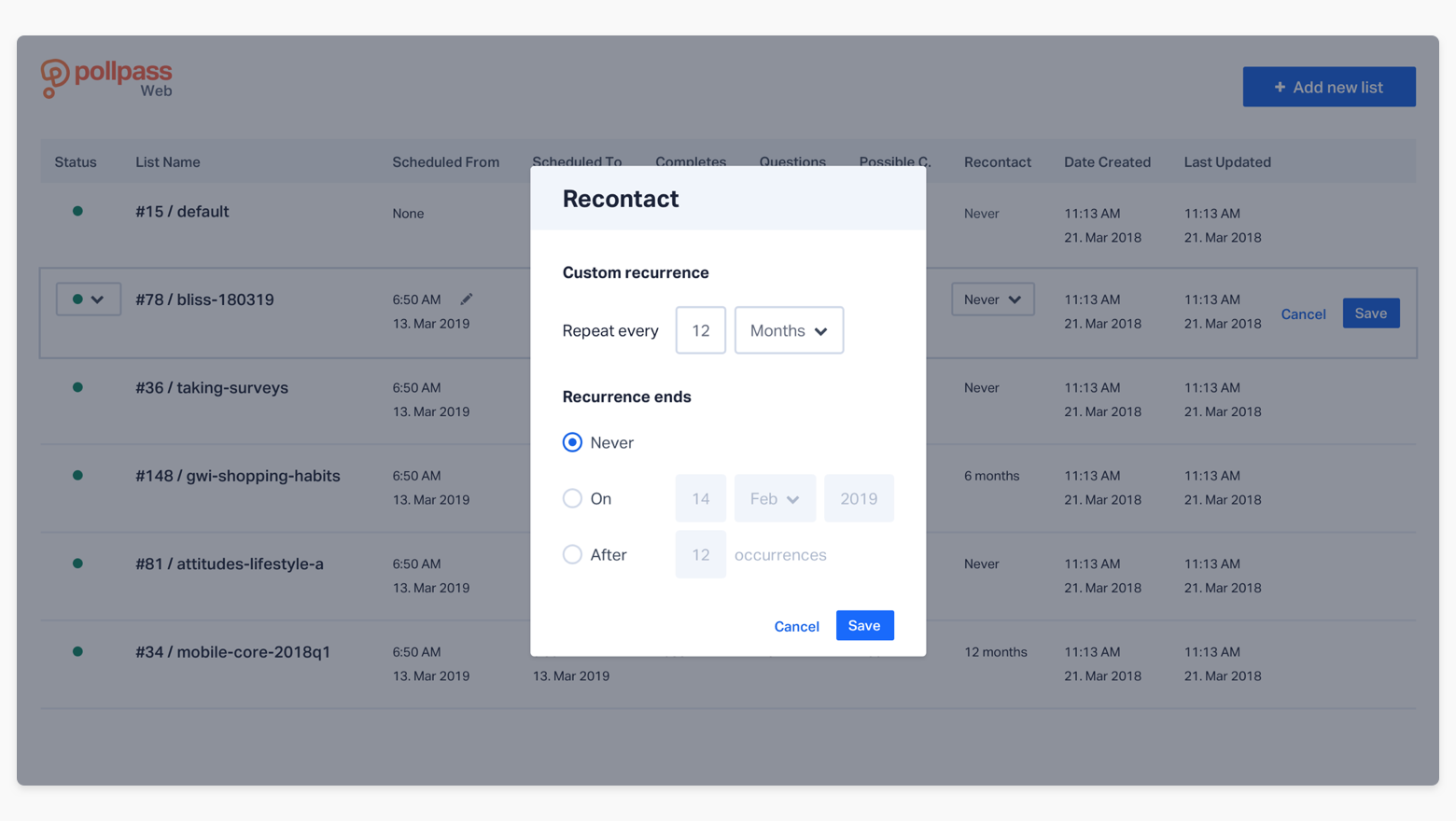
Dash Screenshots:
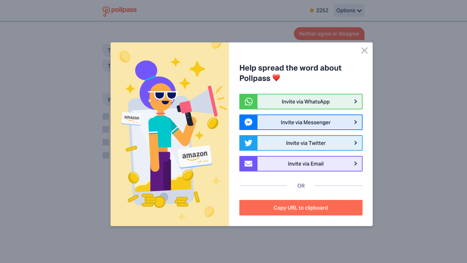
After around 12 months into the role, Dash and Messenger (the chatbot) were now functional and we had proven our Product/Market fit. The next step was proving Growth. Growth, however, had been experiencing a series of problems. Essentially, it had been falling short due to a misunderstanding of our brand and our offering. I proposed absorbing the Growth team into the Design team.This would allow us to streamline our marketing efforts. This decision made sense as the Design team had led the effort to define our company values, how we should sound and act as a brand.
The team were energised by their new remit, they now had a much clearer idea of what was expected of them and how their work would fit into the wider team. We began getting ideas from unexpected places, Front End Developers were suggesting Blog articles that would help with user acquisition and Designers were helping Marketers with Email Marketing tests. User acquisition exploded.
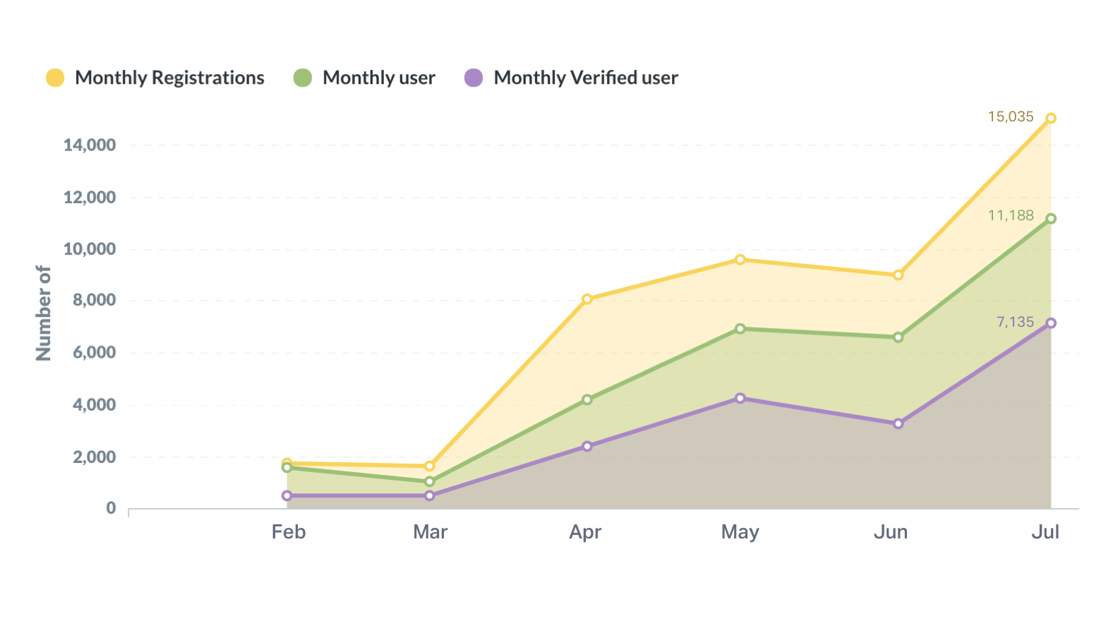
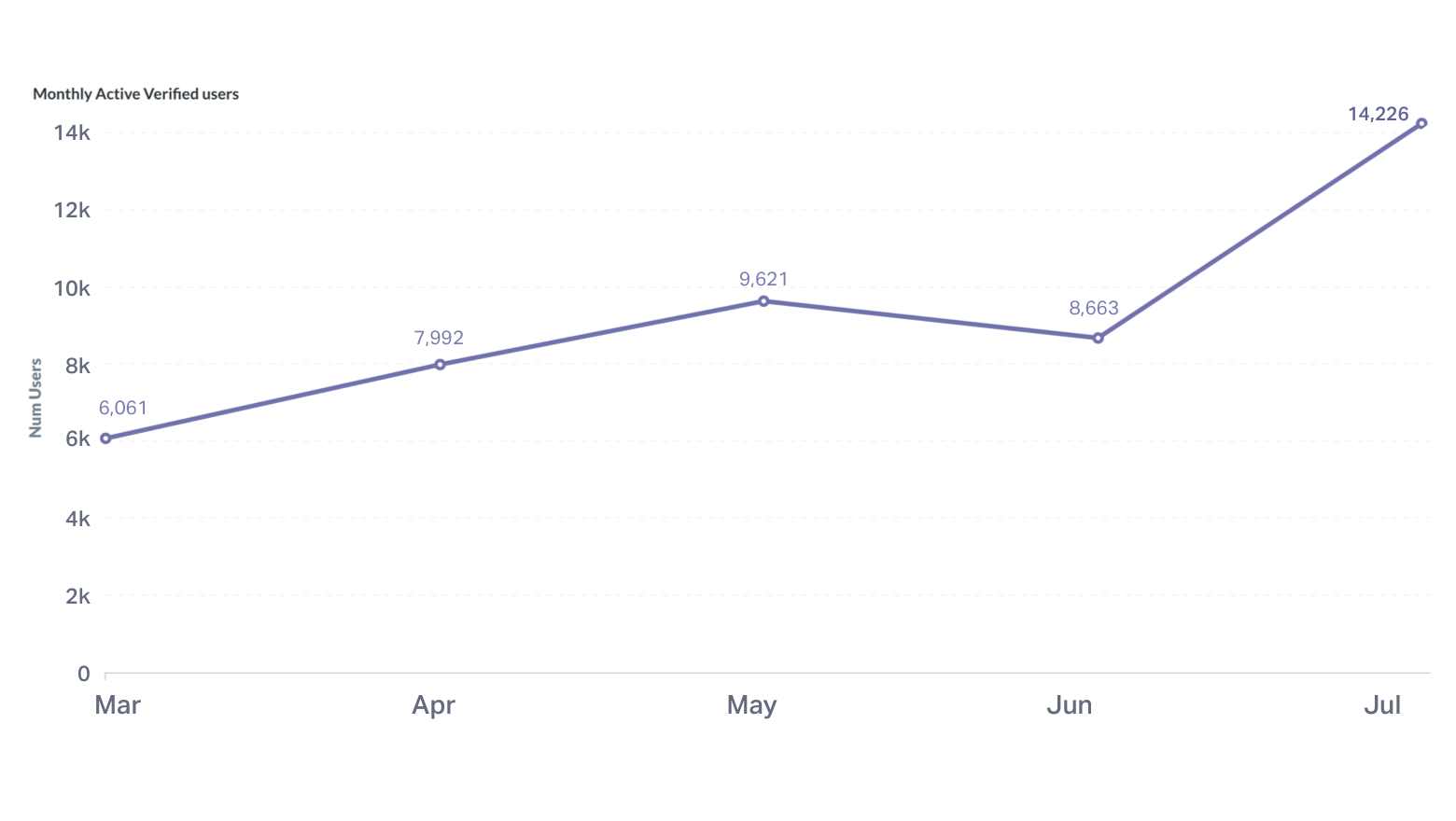
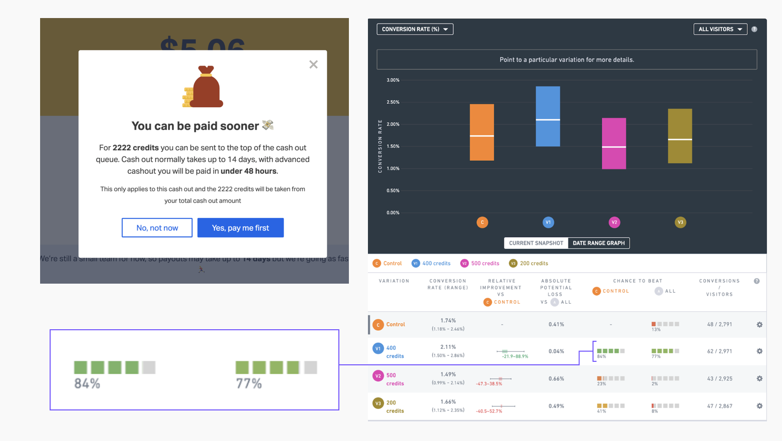
We realigned our metrics to measure whether or not our new efforts were having an impact and found that we were now acquiring and retaining users at a quarter of the cost we had been and at twice the speed.
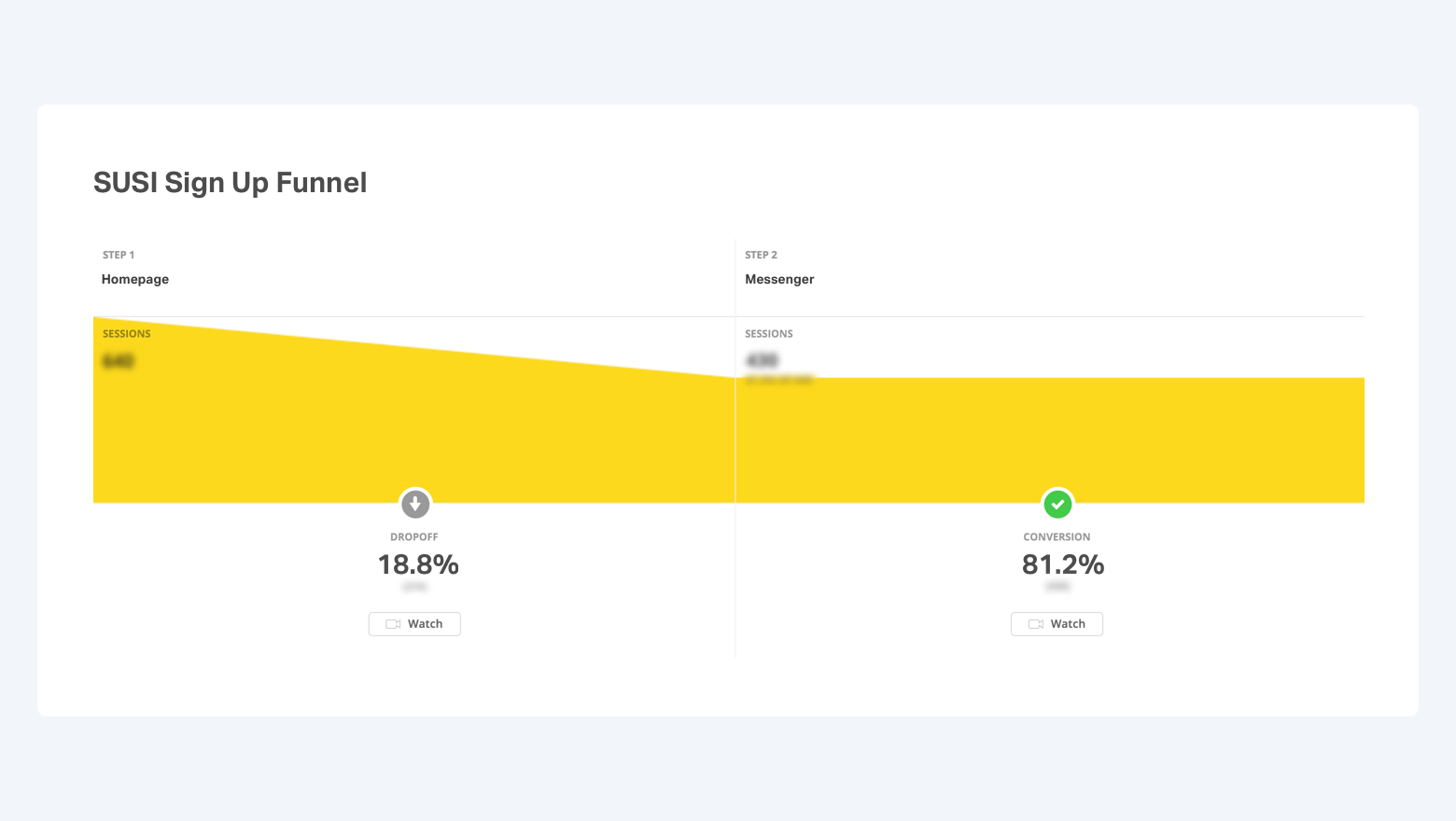
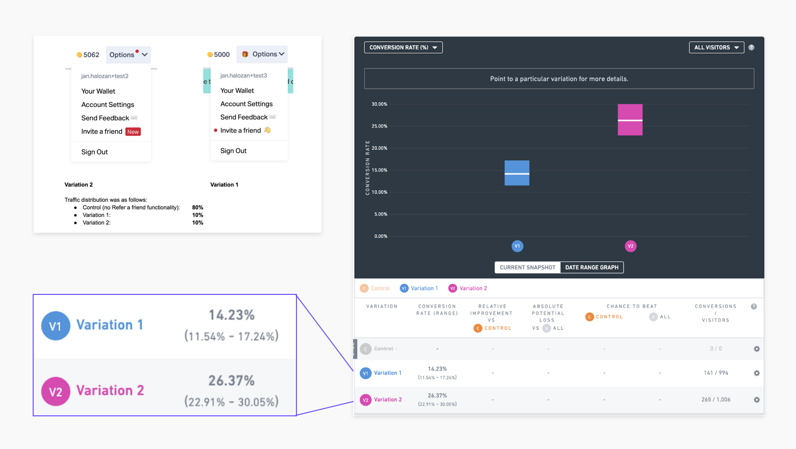
Our approach was to run tests sprint by sprint designed to optimise user growth. Our primary focus was user Retention and Acquisition. We used a tool called Northstar to capture test ideas and learnings. Each test was planned, executed and the results analysed over three sprints, meaning that at least one test and one set of learnings were delivered per sprint. At one point, the UX for our sign up form had been tested so rigorously that it was converting at over 80%!